
Branding
“Auterra is a place where people can walk in and gather to enjoy the simple things in life – good wine, food and good company.”
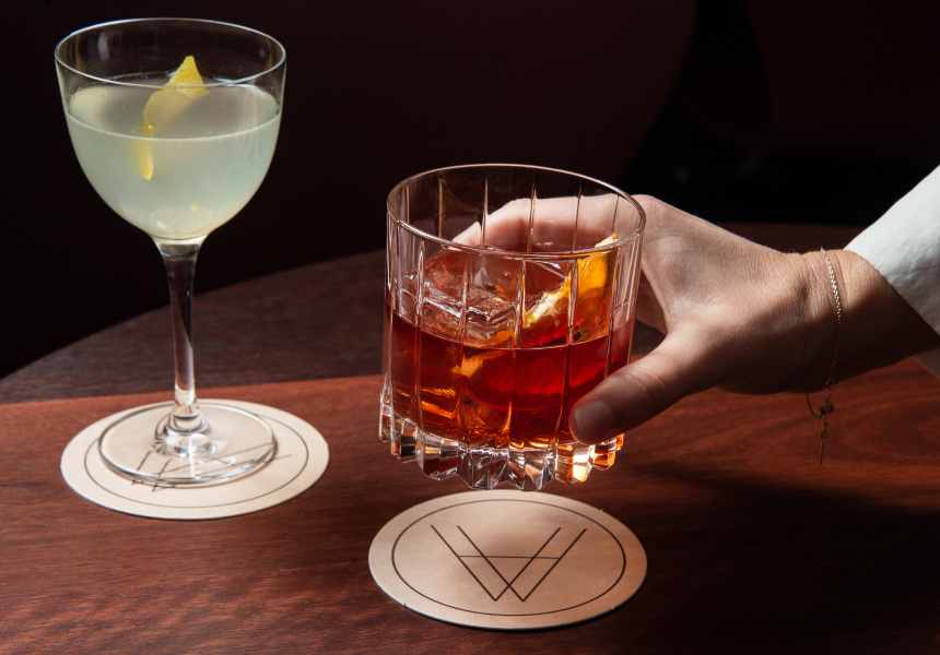
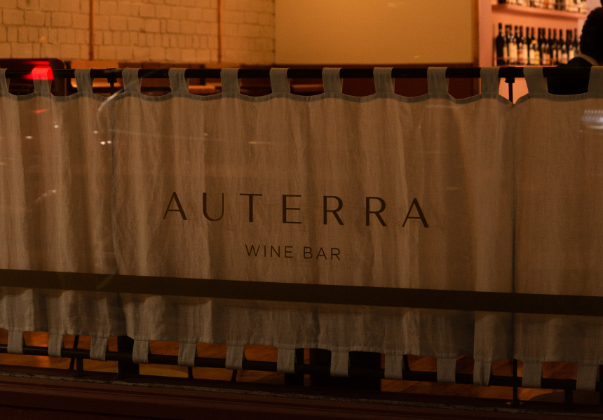
Branding for Auterra — meaning of the earth – a newly opened wine and snack bar in Armadale, Melbourne. The interior of the overall venue is a gradient colour and texture scheme that represents the different tones and pigment of the terroir and the wines themselves. Starting of in the main dining area we have deep rich reds, rust’s and earth tones. This pattern then transforms into the private dining area upstairs with lighter, golden hues and a slightly more elegant colour palate. Ie, champagne etc.
Taking inspiration from the venue’s interior design, we created a really simple but striking logo with a secondary brand element that shows some hills or variant grade in altitudes. The overall design is restrained and focuses on the natural elements, palates and textures.
For Auterra Wine Bar; with Charcoal Creative; photos by Samantha Schultz
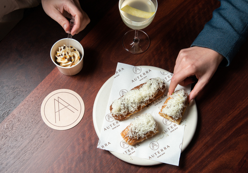
The overall design is restrained and focuses on the natural elements, palates and textures.


